Studio After’s Bloom Archive turns a conceptual idea into a held object. The project, art directed and designed by Chao Hsuan Wang with design contributions from Chung Yu Chen and photography by Qiqi Chew, frames personal growth through the visual language of botanical field documentation. The work has received multiple recognitions: winner of Design Dispatch Future Forward Summer 2026, inclusion in the Communication Arts Design Annual, and a Silver Award in the Graphis Design Awards 2027.
At the center of Bloom Archive is a single proposition: everyone blooms in their own season. Wang translated that proposition into concrete design decisions across packaging, cover, and the journal’s monthly opening spreads. Rather than relying on a single symbol, the team used sequential imagery and editorial structure to make the passage of time legible and humane. Wang’s work as art director and designer emphasized visual continuity so that each element—whether cover, panel, or spread—reads as part of a continuous process.
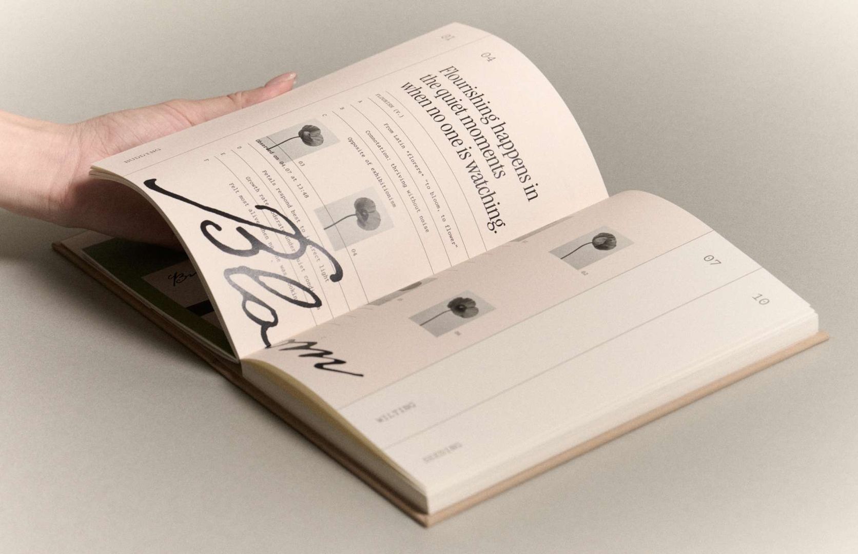
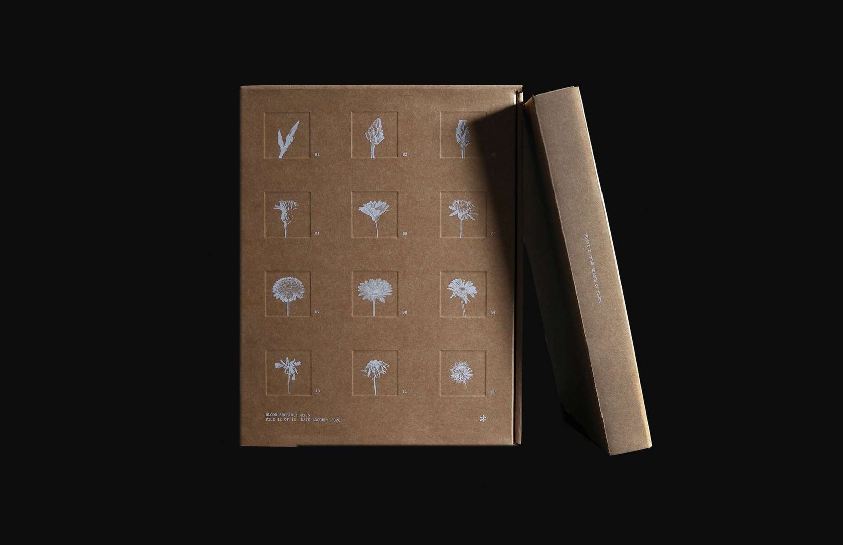
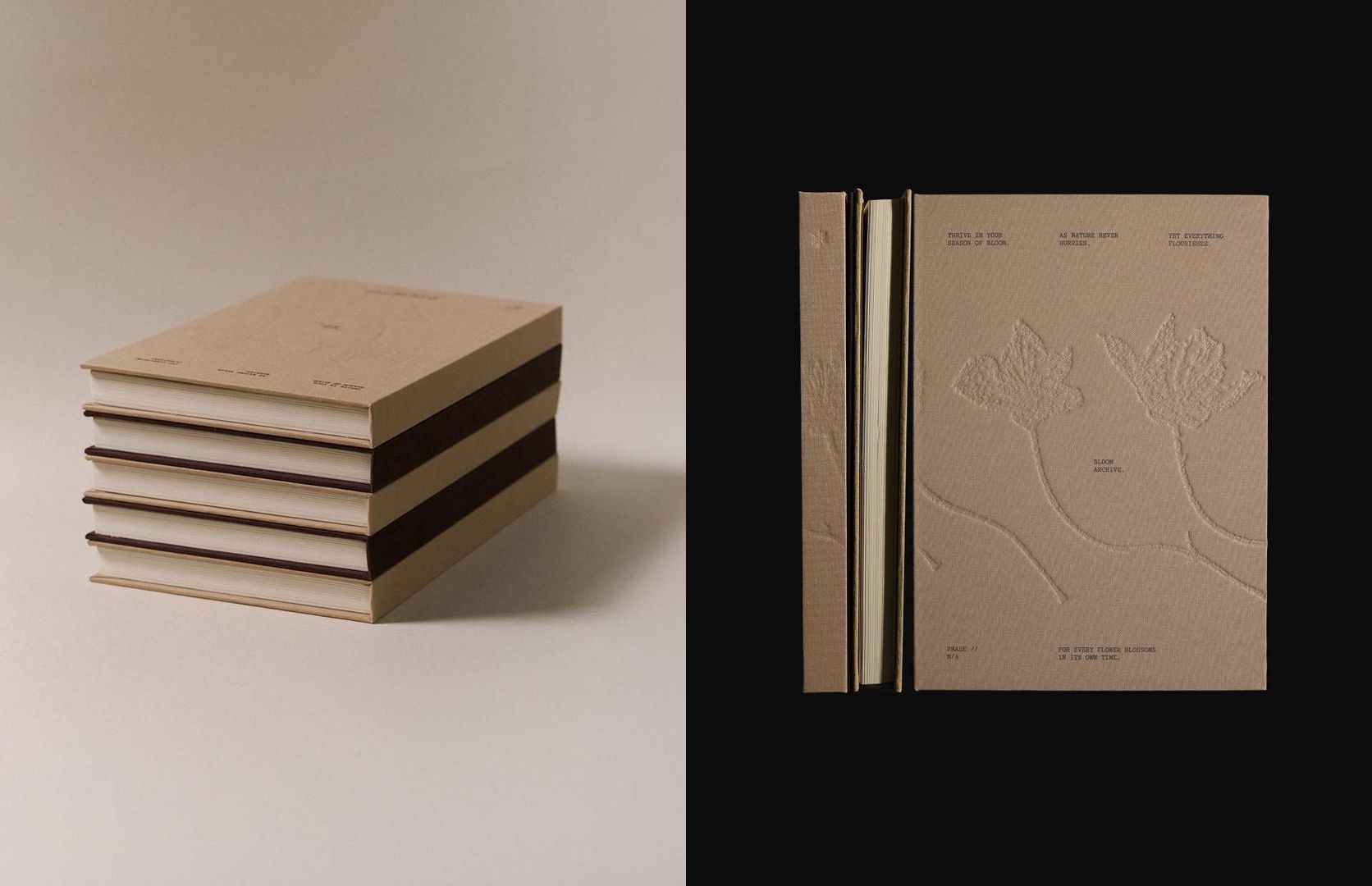
For the packaging, Wang arranged a flower’s life cycle across twelve panels, from budding to flowering, withering, and fruiting. The sequence is not meant to assign stages to particular months. Instead, the twelve-panel layout echoes the journal’s year-long use and underlines the project’s core message: every stage has a place, and progress is not measured against a universal timetable. That same logic shaped the cover, where a flower progresses across the back and front, using successive still images to suggest continuity and change.
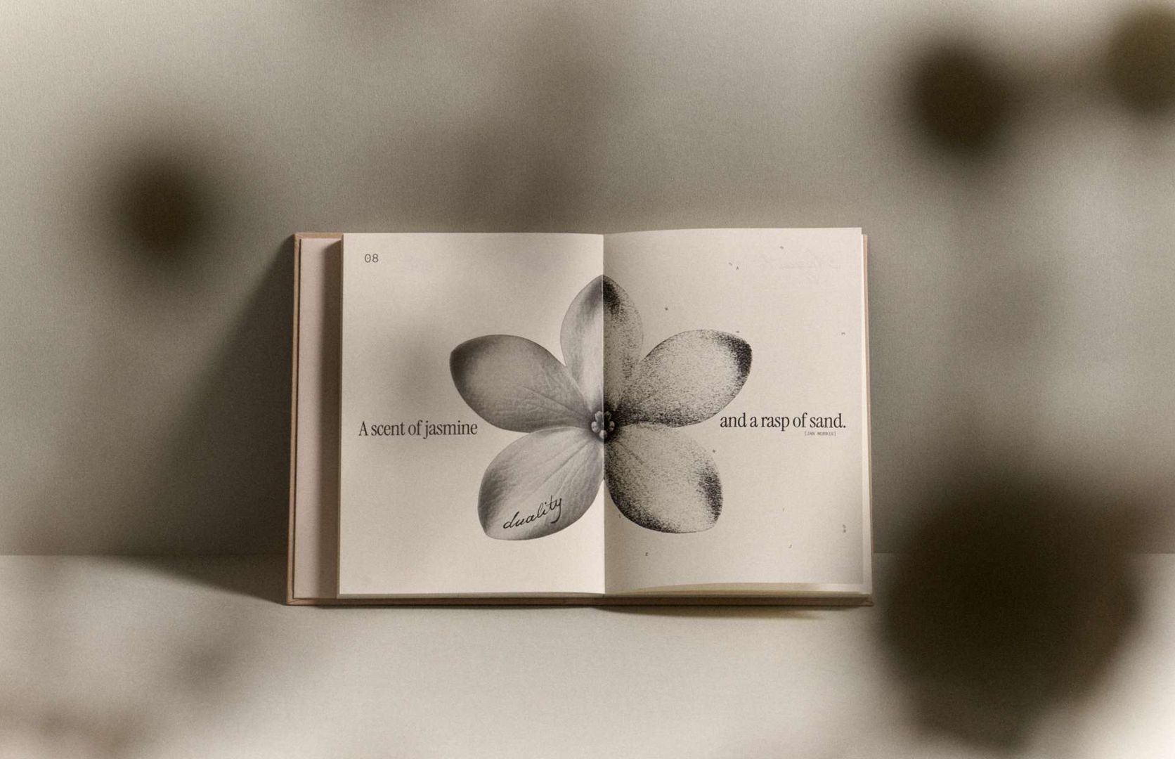
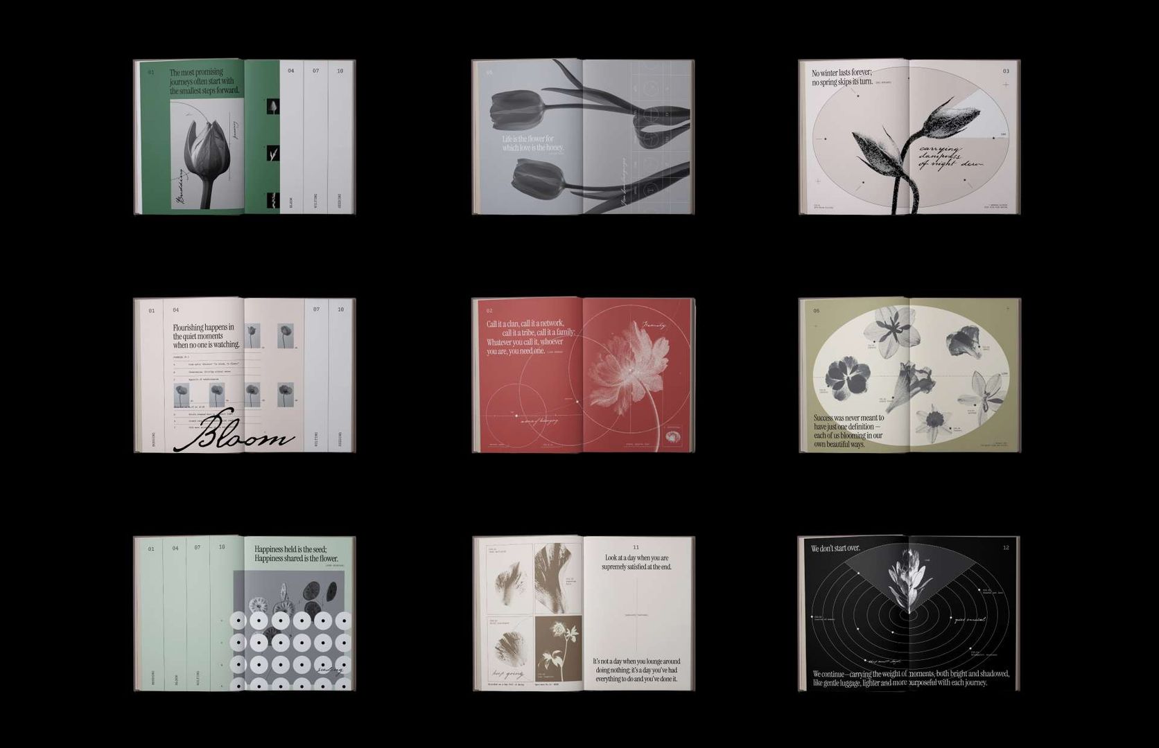
Wang also designed the monthly opening spreads around quotations selected by the client. To maintain variation within a cohesive system, she grouped the twelve months into three visual perspectives on time: “Blooming in a Lifetime,” “Blooming in the Seasons,” and “Blooming in a Day.” These three groups introduce distinct expressions for each month while preserving a shared aesthetic and editorial rhythm.
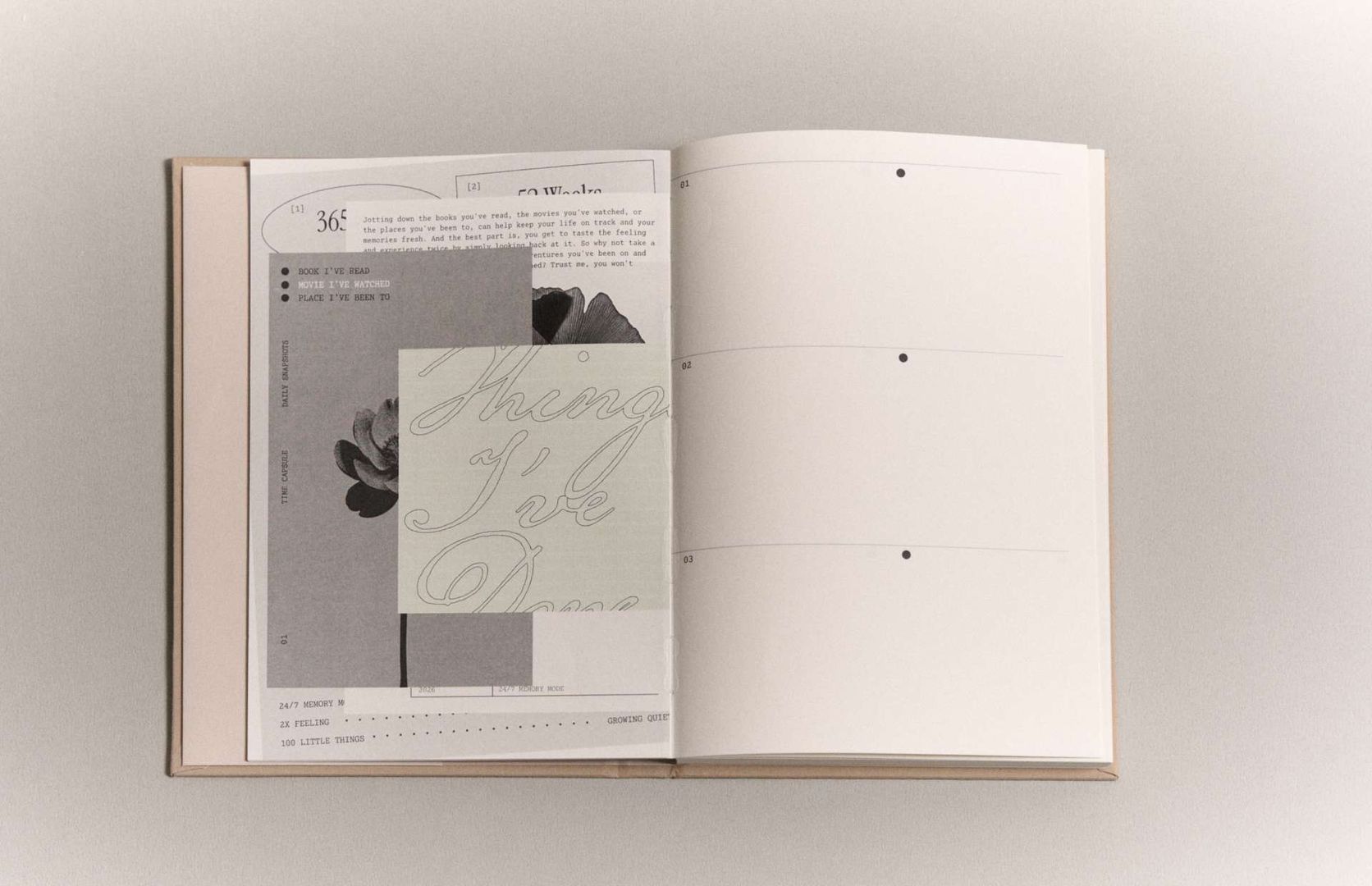
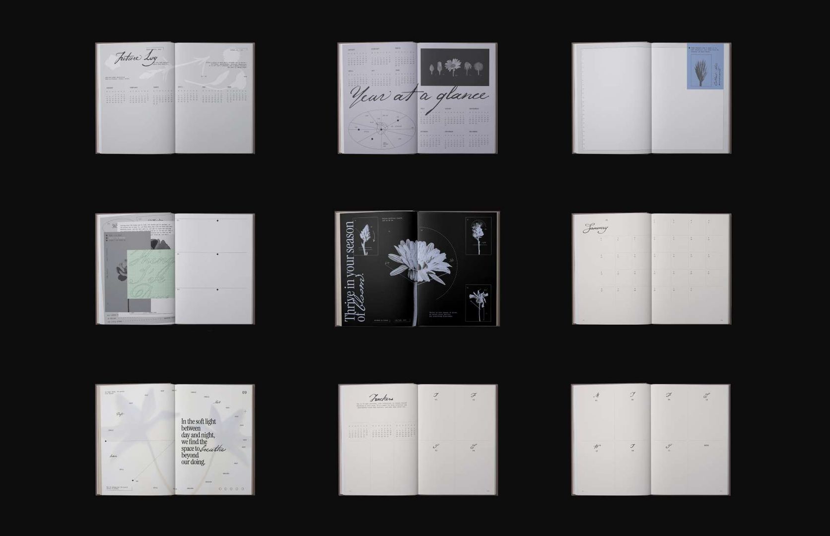
Chung Yu Chen focused on the journal’s planning and habit tools: monthly and weekly planning pages, trackers, and memo pages. The brief required that the journal remain engaging over twelve months, so Chen introduced seasonal shifts in layout without breaking the identity. Subtle changes in format, rhythm, and microstructure renew interest as the year progresses while ensuring that the planning pages remain recognizably part of the same visual system.
Design decisions for the planning pages balanced continuity and change. The layouts vary by season to avoid repetition, but their grid, typographic hierarchy, and use of botanical cues maintain coherence with Wang’s opening spreads. This distinction between opening spreads and planning pages was an intentional division of labor: Wang shaped the project’s expressive, editorial moments while Chen solved for use and longevity.
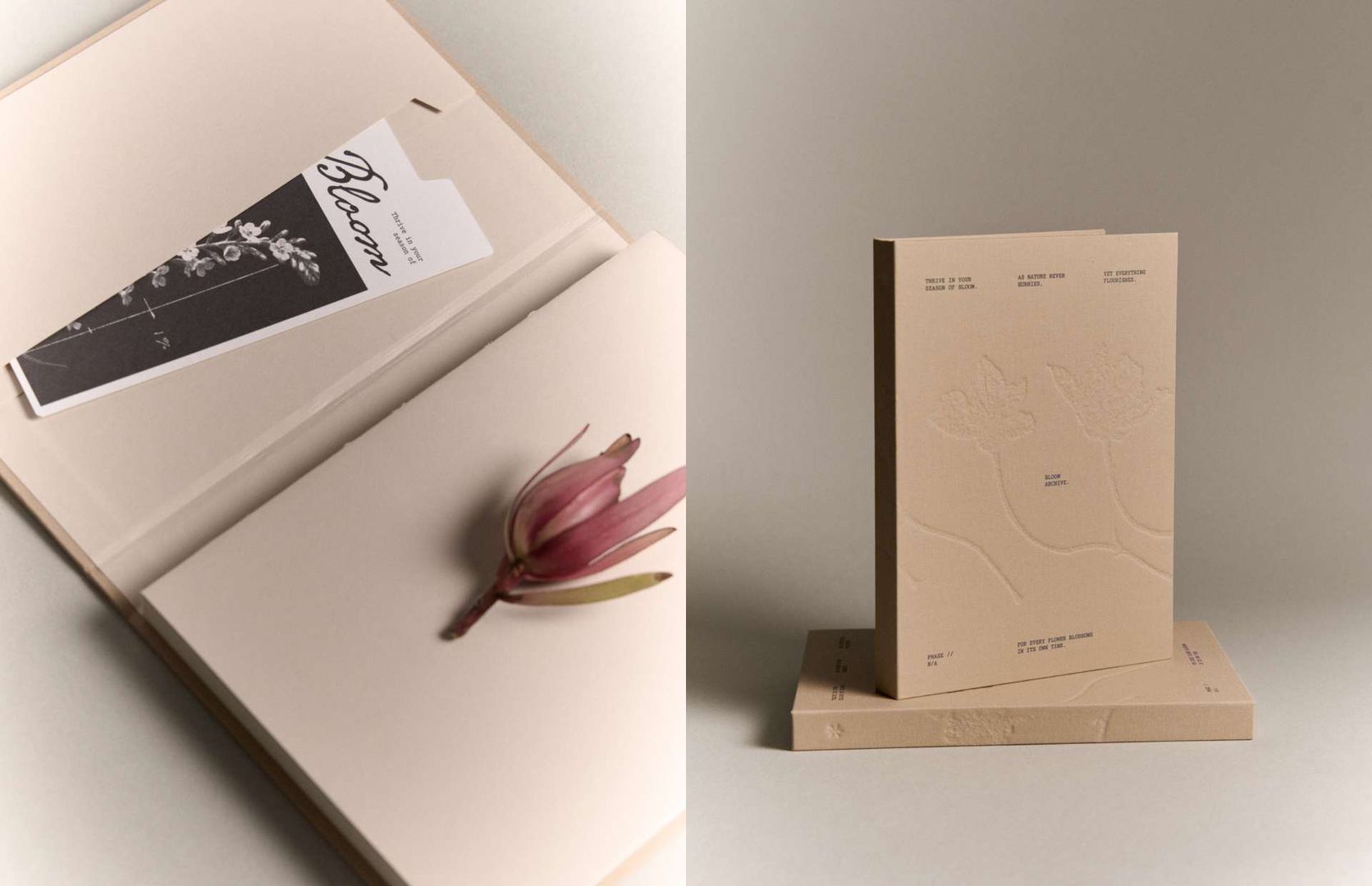
Material and production choices support the conceptual work without overwhelming it. Thoughtful binding, packaging, and printed details give the journal a tactile presence that encourages repeat handling. Where possible, production details were used to make the metaphor legible: the sequence of still images across covers and panels reads like an archival specimen, and binding details emphasize the book as an object to be carried and used.
Bloom Archive’s visual language was installed at Weight Books in Taiwan from December 8, 2025, to January 12, 2026. The exhibition translated the journal’s editorial motifs into a physical setting by presenting printed spreads, packaging panels, and small takeaways that echoed the project’s calendar logic. Documentation from the installation shows how the identity scaled from an object intended for personal use to a set of display pieces adapted for a retail and gallery-adjacent environment.
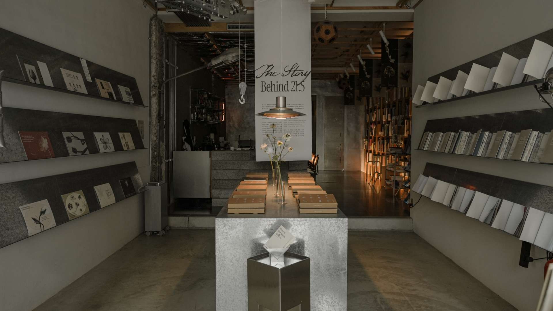
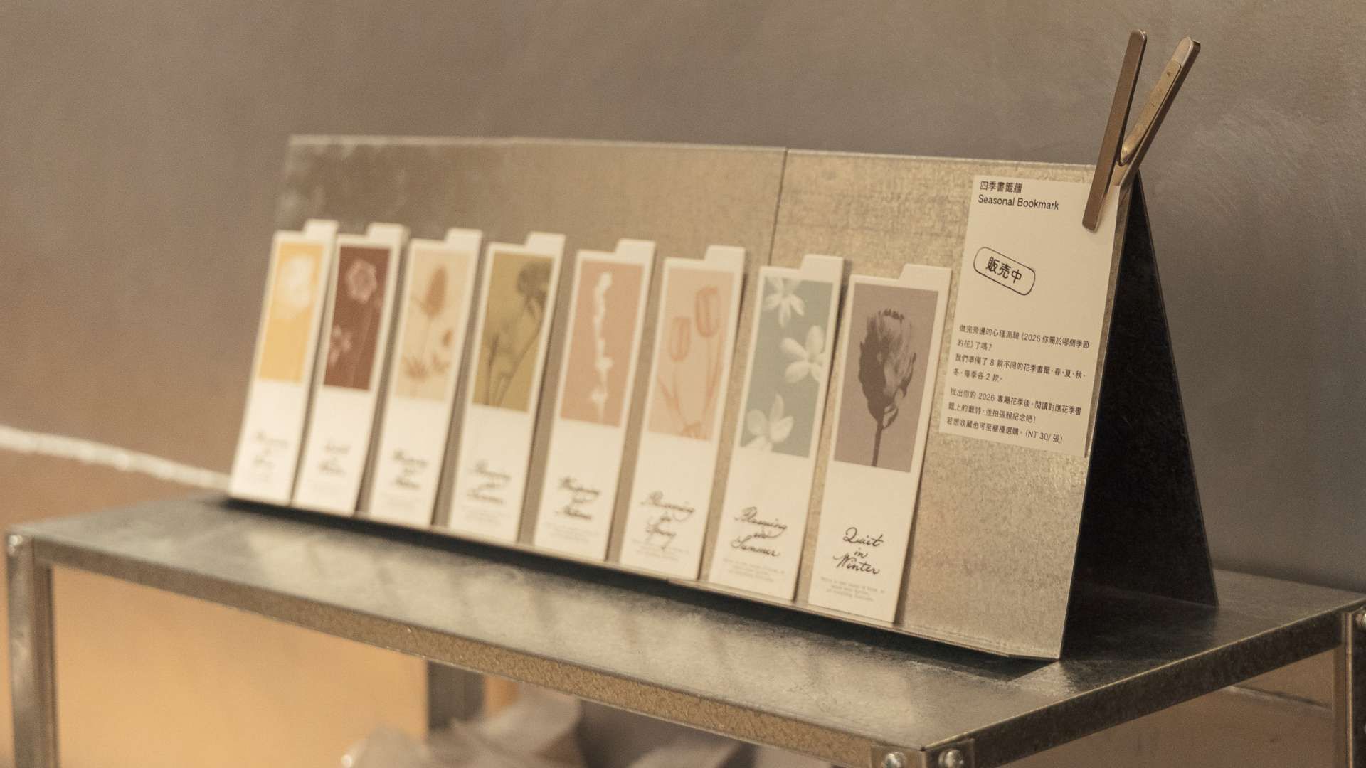
The project’s reception among juries reflects how an idea, executed with craft, can resonate across formats. Bloom Archive was named a winner of Design Dispatch Future Forward Summer 2026, selected for inclusion in the Communication Arts Design Annual, and received a Silver Award in the Graphis Design Awards 2027. Photography for the project is by Qiqi Chew.
Chao Hsuan Wang is the art director and designer at Studio After. With more than a decade of experience in visual design, she centers her practice on brand communication, art direction, and building flexible visual systems. Wang’s role on Bloom Archive included art direction, packaging, cover design, and the twelve monthly opening spreads. Her work arranged the journal’s imagery as a continuous sequence and organized the monthly themes into three visual groups that explore time at different scales.
Chung Yu Chen is the creative director at Studio After. With more than a decade of experience, he focuses on systems thinking and scalable visual narratives. For Bloom Archive, Chen designed the functional planning pages: monthly and weekly layouts, trackers, and memo pages. His approach introduced seasonal variation to sustain engagement while keeping the pages grounded in the project’s overall identity.