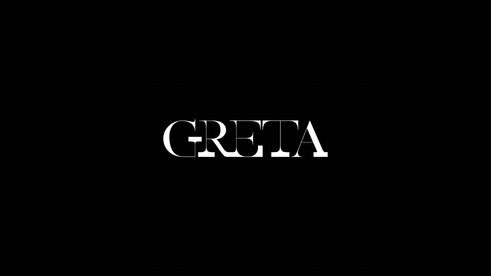
In the modern digital landscape, information is often consumed in a near-silent vacuum. We scroll through headlines of catastrophe and captions of urgency on mute, flattening the texture of global crises into static pixels. But what happens when typography refuses to be silent? How do you capture the tremor of anger, the rhythm of urgency, or the sheer volume of a generational plea for survival using only the alphabet?
For Woojung Lee, a New York-based Art Director, the answer lies in breaking the fundamental rules of typography. With her award-winning project Greta, Lee challenges the static nature of design, proving that in the right hands, type doesn’t just sit on a page; it eventually disappears. Greta is not merely a typeface; it is a kinetic translation of the climate crisis, a visual system designed to mirror the collapsing ecosystems it warns us about.
The project opens with a stark declaration: "We, humans, are destroying our home planet because we are so greedy". This core idea establishes that Greta is deeply rooted in the tangible reality of environmental degradation, not just aesthetic experimentation.
At the foundation of the system is a serif typeface designed around intentional, jarring high contrast. While traditional typography seeks harmony and balance to facilitate easy reading, Lee’s design deliberately creates unease. The letterforms are physically split into two opposing, warring sides. One side of the letter is rendered in a skinny, hairline stroke—fragile and delicate. The other side is significantly thicker, domineering, and heavy.
This structure is not a purely stylistic choice; it is a narrative architecture derived directly from the project’s central thesis. As the narrative explains, the project embodies the message that "we have lost balance between money, people, and the environment". The thin stroke represents the environment, fragile and increasingly worn down by external forces. The heavier stroke embodies human greed—dominant, excessive, and ever-expanding.
The result is a typeface that looks visually strained, as if the letters are leaning under their own weight or being pushed off balance by their own excess. It serves as a diagram of environmental tension. Nature has always existed quietly, willing to give everything, while greed, by contrast, is heavy and loud. Woojung designed the letters to physically manifest that pressure. The imbalance remains unresolved because, as the project explicitly questions, "What is the point of having all the money in the world, if the planet becomes uninhabitable?".
While its static letterforms introduce the theme of imbalance, Greta’s full impact is realized through kinetic typography. In a field where animation often serves merely for visual appeal or retention, Woojung employs movement as a potent tool for storytelling and a stark warning.
Breaking the convention of typical digital animations—which are designed to loop indefinitely to suggest comfort, continuity, and stability—Greta’s animation deliberately does not reset. The motion mirrors the terrifying reality of extinction: once nature is lost, it is gone forever. This choice reflects the text’s prioritization of "fairytales of eternal economic growth" over the survival of living beings.
Underlying the entire project is a clear sense of finality. The typeface is not designed to feel timeless or archival, traits usually prized in font design. It is intentionally unstable, reinforcing the idea that time itself is running out.
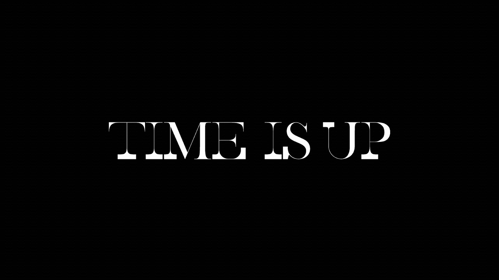
The climax of the piece delivers this message with brutal efficiency. After asking the audience what the point of wealth is without a habitable planet, the screen fades to black, and the words "TIME IS UP" appear in white text.
This design choice echoes the sentiment of the speech that inspired it—an insistence that economic growth loses relevance in the face of environmental collapse. Rather than offering solutions or optimism, Greta asks the audience to sit with discomfort. The design does not reassure; it confronts. It forces the observer to watch the message die on the screen, a microcosm of the larger extinction event Thunberg warns of.
Though named after Greta Thunberg, the project avoids overusing literal imagery of the activist herself. Aside from a few brief glimpses of her speaking at the podium, the work focuses on the system of the typography. Woojung Lee art-directs Greta as a "system of dissent," embedding ideology into structure rather than just copy.
Any message set in this typeface inherits its tension. Whether used in a static poster or a motion-based manifesto, the underlying unease remains visible in the thick-thin contrast. By focusing on systems rather than statements, the project allows form itself to carry meaning. The medium becomes the message.
Despite its expressive and experimental qualities, Greta is rigorously constructed. The legibility is maintained even as the letters begin to fragment, and the kinetic behaviors follow consistent rules of physics. This balance between experimentation and control reflects Lee’s art direction approach, where concept and craft are inseparable. The typeface is a functional tool for activism, capable of turning any text into a protest.
In the face of escalating climate anxiety, the Greta project stands as a powerful demonstration of how art direction can translate complex global concerns into a poignant visual language. By employing sharp contrast, evocative motion, and gradual disappearance, the work redefines typography, transforming it from a decorative element into an urgent warning.
The narrative skillfully connects the global to the personal: from the macro view of a damaged planet to the micro-level disintegration of a single letterform. This connection anchors the global crisis directly to the pixels on our screens. The typeface, designed to "scream through its contrast and bleed through its motion," challenges audiences to deeply reconsider the true meaning of value.
As its creator, Woojung Lee, notes, "Design is one of the most powerful communication tools; even without knowing the language, we can sense the tone and what visual means. People usually think design has to be aesthetic, but if the reality is not, design shouldn’t pretend otherwise. I just want a better future for everyone. That was the wish behind this project."
Greta ultimately leaves the audience with a haunting question and a fading visual. It serves as a stark reminder: if we continue to prioritize the "heavy stroke of greed" over the "fragile stroke of nature," we will be left with nothing. In this project, typography does more than communicate; it prophesies. It fractures, fades, and slips away until there is nothing left.



