Creative ExchangeCreative Exchange
  • Art
  • Branding
  • Graphic Design
  • Fashion
  • Music

Creative Exchange © 2026 All Rights Reserved

Interview — Songwon Kim on Designing Brands That Sell: From RED PRO to etleé

5 days ago • 10 min read

Jason Moody

Editor, Creative Exchange

Graphic Designer, Ivy Enterprise

Interview by Jason Moody

NEW YORK — July 2025

Based in New York, graphic designer Songwon Kim works on Ivy Enterprise’s brand design team. She leads packaging, identity, and advertising projects for brands including RED PRO, Kiss New York, and etleé, which launched in July 2025. Her focus is straightforward: build clear visual systems that read in every channel and support how each product is actually sold—on shelf, online, and at trade shows.

Q1. etleé just launched. How would you describe your role at Ivy Enterprise?

I handle end-to-end brand work—naming, logos, packaging, ad materials, and trade-show graphics—so each line stays consistent across shelf, e-commerce, and social. That also means aligning with product, marketing, and sales so design reflects real constraints like cost, timelines, and retailer specs.

Q2. RED PRO’s X‑King Vector Motor Cordless Clipper stood out in a crowded pro-tool market. What did you do differently?

Function had to read fast. I built a hinged, book-style carton with a molded EVA cradle for salon-grade protection, wrapped the exterior in brushed gold to signal premium, professional-grade power, and used a deep black rear panel for contrast and legibility. A macro close-up of the “Premium Vector Motor” sits front and center, so the engineering edge is obvious at shelf. Packaged under that system, the X-King drew large crowds at Barbercon Orlando 2024 and then anchored RED PRO’s booth at the 2025 CT Barber Expo—the world’s largest men’s grooming trade event, with over 15,000 attendees from 43 U.S. states and 36 countries. Post-show surveys showed barbers frequently cited the “gold toolbox packaging” as their primary stop factor, and the clipper went on to win Men’s Journal’s 2025 Grooming Award for “Best Hair Clippers for Professionals,” with editors praising its “studio-ready look and crystal-clear spec call-outs.”

Q3. Kiss New York is a legacy brand. What did the 2025 refresh accomplish?

Strong formulas, scattered visuals. I re-centered the brand on “Own your day, it’s your moment,” created a new logo-symbol system, set an ivory/black palette with a Times Square–inspired gradient wordmark, and wrote guidelines so teams could move quickly without drifting. Results showed up fast: Marie Claire highlighted the Tinted Moisturizer SPF 32 as “Best Skin Tint for Deep Tones,” internal mockup cycles dropped from about a week to a day, and customer questions about shade selection decreased.

Q4. What is etleé as a brand, and what’s ahead?

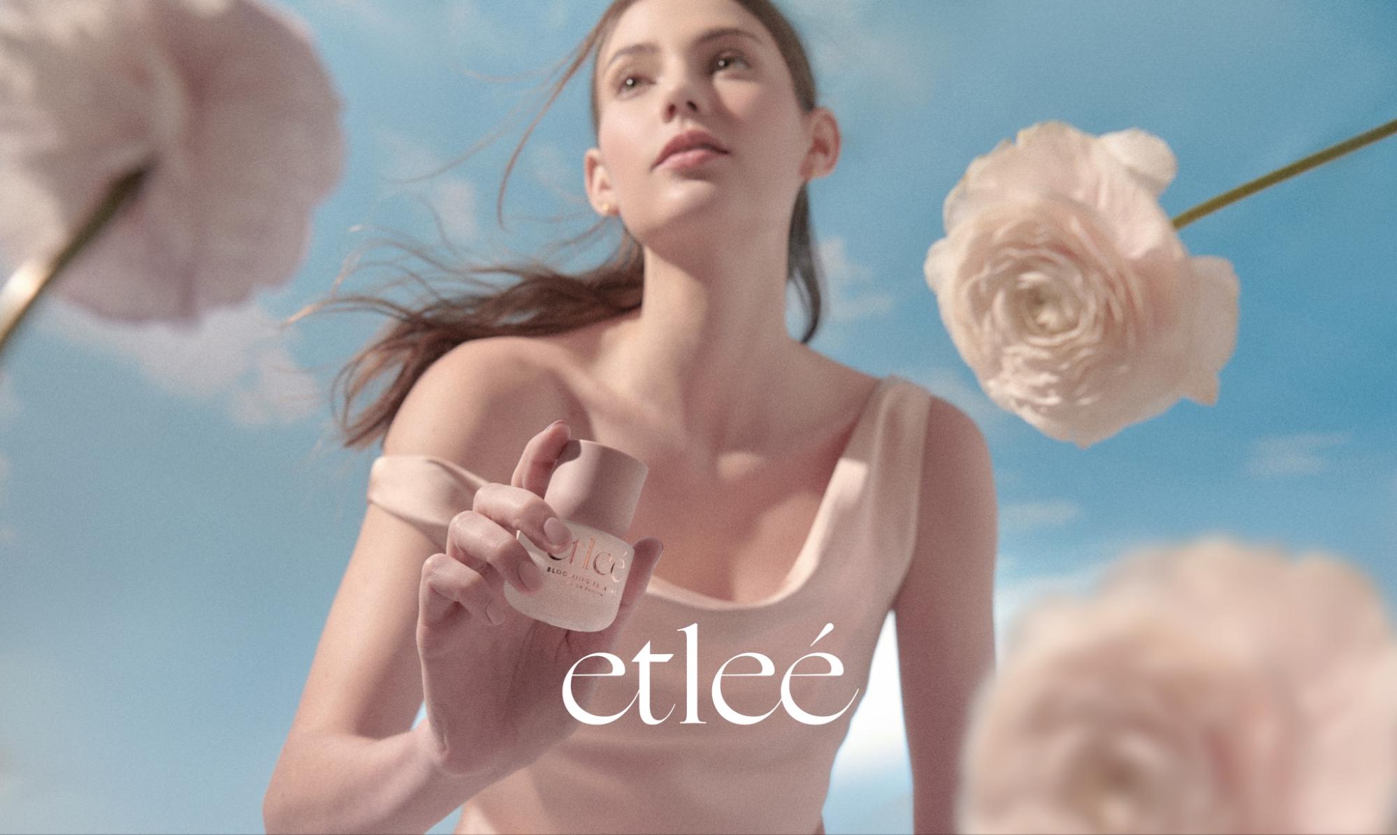
Etleé is positioned as “accessible luxury” fragrance. It launched in beauty-supply stores and will expand to chain retailers like Target and Walmart and dedicated online channels. Over the next two years, I’ll keep developing new lines—seasonal drops, gift sets, and potential collaborations—and broaden the brand’s reach while keeping the core identity tight.

Kim’s work now appears across 10,000+ retail doors in 60 countries, spanning tools, cosmetics, and fragrance. The common thread is disciplined systems that lift sales and speed execution. With RED PRO performing, Kiss New York reset, and etleé poised for sustained expansion, her impact at Ivy is measurable and ongoing.

Continue reading

thumbnail for article titled The Young Jerks tap into the raw aesthetic of commercial art's darker side in their branding.

The Young Jerks tap into the raw aesthetic of commercial art's darker side in their branding.

The Young Jerks' packaging and branding design pay homage to the grittier side of commercial art, evoking a sense of raw energy and rebellion. By embracing unconventional aesthetics, the band's visual identity sets itself apart from mainstream expectations, capturing their unique sonic spirit.

6 days ago

Latest articles

Similar articles

thumbnail for article titled Threads branding origins revealed by internal designers.

Threads branding origins revealed by internal designers.

The Threads design team drew inspiration from Twitter's existing branding while introducing a fresh aesthetic to match the new app's identity. By incorporating subtle visual updates and familiar elements, the team successfully created a distinct look that still resonates with users who were already invested in Twitter.

2024-04-21

thumbnail for article titled Plant Heritage Revealed at Historic Garden Estate in England

Plant Heritage Revealed at Historic Garden Estate in England

Borde Hill Country Garden in West Sussex has unveiled its new identity, focusing on the beauty of nature and the unique character of its surroundings. The redesign features an understated yet striking aesthetic, with carefully curated plant species taking center stage.

2015-12-23

thumbnail for article titled First Choice faces disruption by upstart Ragged Edge

First Choice faces disruption by upstart Ragged Edge

First Choice, a well-established British travel agency, has undergone significant changes under the leadership of Ragged Edge. The company's rebranding marks an effort to modernize and expand its offerings in the competitive travel industry.

5 days ago

thumbnail for article titled Five Microscopic Models Underpin New Advertising Agency

Five Microscopic Models Underpin New Advertising Agency

The logos of &Walsh, a new advertising agency, are inspired by microscopic organisms, emphasizing the creative and innovative approach to advertising. The unique designs showcase the brand's ability to observe and understand the complexities of the human psyche in order to develop effective marketing strategies.

2020-12-25

thumbnail for article titled Cardiff University Unveils New Brand Identity in Honor of Unique Welsh Letter Combinations

Cardiff University Unveils New Brand Identity in Honor of Unique Welsh Letter Combinations

The University of Cardiff has undergone a major rebranding effort to showcase its unique cultural identity. The university's new branding features an exciting visual representation of the eight traditional Welsh digraphs, paying tribute to Wales' rich linguistic heritage and reinforcing its connection to the country.

2024-01-02

thumbnail for article titled From Selling Clothes to Selling Ideas

From Selling Clothes to Selling Ideas

How Daeyun Kim went from running a small fashion store to winning 35 global advertising awards When creativity becomes a survival instinct, boundaries start to blur. New York–based art director Daeyun Kim is one of those rare creatives who built his craft not from classrooms, but from the str

2026-01-21

thumbnail for article titled Talbott and Arding's Identity Places Emphasis on the Gourmet Side of Graphic Design

Talbott and Arding's Identity Places Emphasis on the Gourmet Side of Graphic Design

A growing trend in branding, Identity for Talbott & Arding showcases a sophisticated and refined approach to graphic design. The result is a visually stunning identity that elevates the company's reputation as a high-end provider of luxury goods.

2023-10-26