Creative ExchangeCreative Exchange
  • Art
  • Branding
  • Graphic Design
  • Fashion
  • Music

Creative Exchange © 2026 All Rights Reserved

From Broadcast to Brand Events: Muriel SeoYeon Choi Defines Motion Design in 2025

2025-08-29 • 13 min read

Emily Carter

Editor, Creative Exchange

From Broadcast to Brand Events: Muriel SeoYeon Choi Defines Motion Design in 2025

New York, NY – 2025 — In an era where visual storytelling defines how media is consumed and remembered, motion designer Muriel SeoYeon Choi is emerging as one of the creative forces shaping that landscape. Based in New York and contributing through BGSTR, Choi has been entrusted with assignments for AMC Networks, NBC Sports, and the History Channel—projects that demand both technical mastery and a refined sense of narrative design.

Her ability to move fluidly between entertainment broadcast and large-scale corporate events demonstrates the growing importance of motion design not only as decoration, but as a central driver of audience engagement, brand recognition, and storytelling clarity.
Defining AMC’s Brand Voice at the Upfront 2025

image

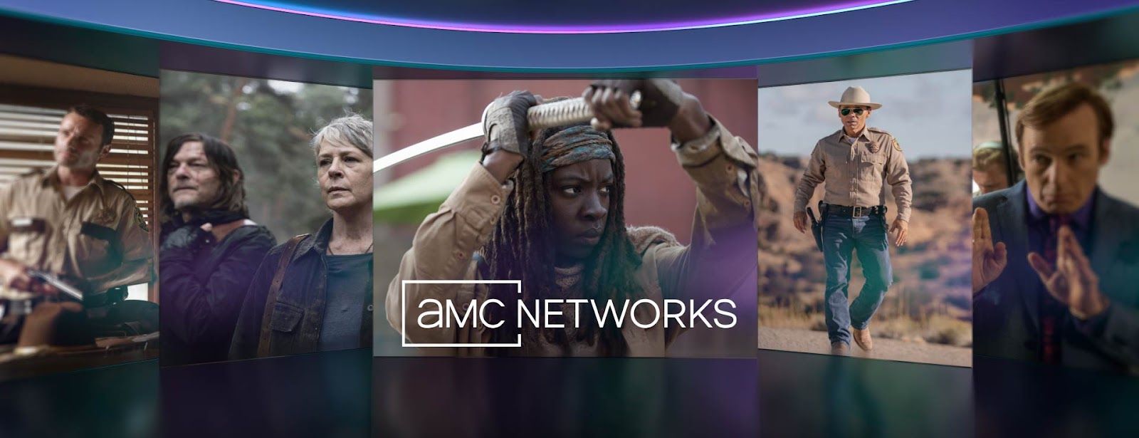
The AMC Networks Upfront is one of the most high-stakes events on the media calendar. Each year, AMC presents its upcoming programming lineup to advertisers and media executives—an audience whose buy-in directly influences the network’s annual revenue. For 2025, Choi played a pivotal role in shaping the event’s visual language.

Her work combined 2D/3D design and animation to ensure that every motion element—from title sequences to transitional graphics—spoke in a unified brand voice. In a context where visuals carry as much weight as the spoken message, Choi’s designs helped AMC communicate its identity as both innovative and consistent.
image

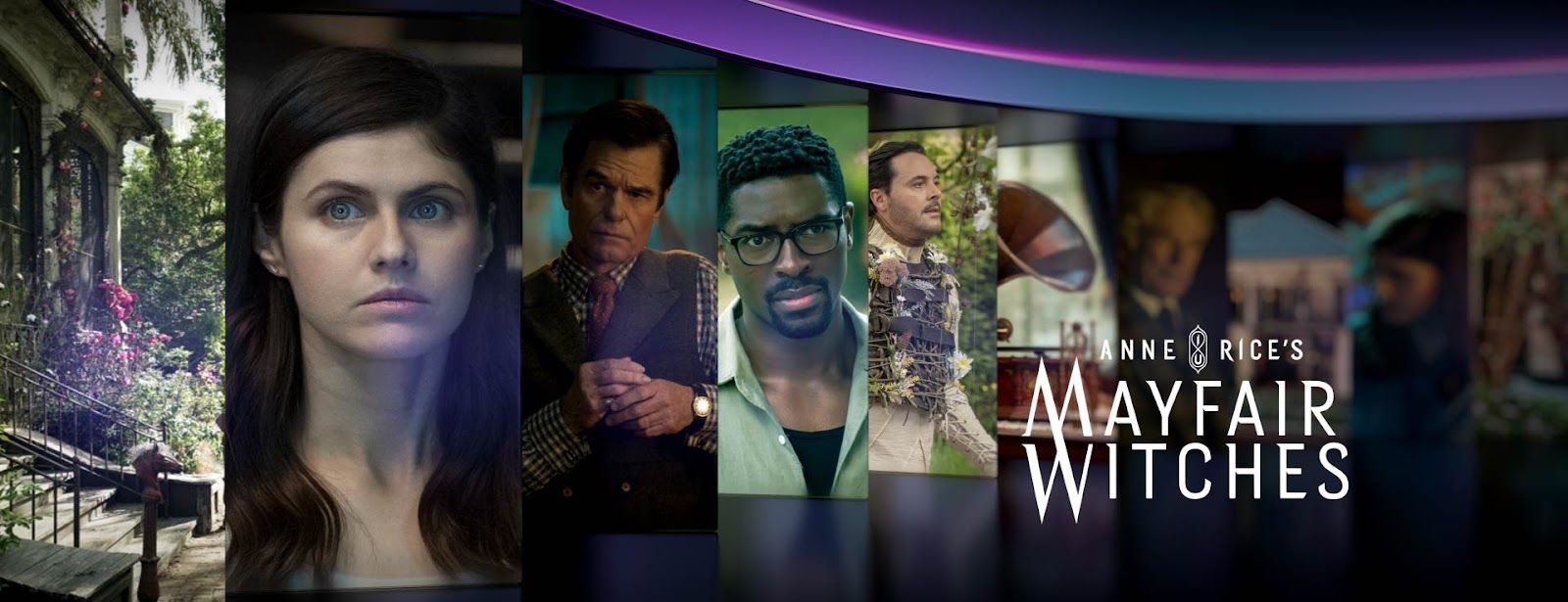
The result was a cohesive experience that positioned AMC’s diverse programming under a single, powerful identity. In doing so, Choi’s work not only supported the event but directly contributed to AMC’s ability to make a lasting impression on its most critical stakeholders.
Elevating Sports Broadcasts with NBC Sports

image

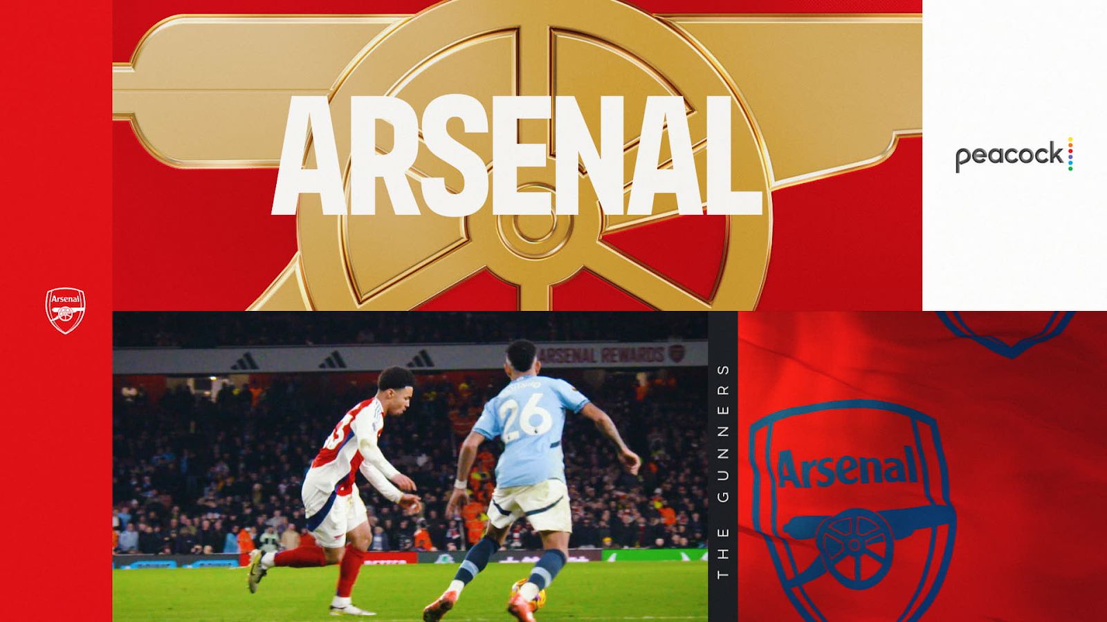
While corporate events demand unified brand cohesion, live sports broadcasts thrive on spectacle and immediacy. For NBC Sports’ Premier League coverage—one of the most-watched broadcasts in U.S. sports—Choi reimagined the league’s iconic visuals into high-impact 3D experiences that honored tradition while captivating American audiences.

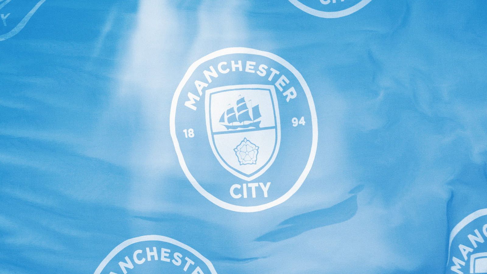
She transformed the Premier League’s lion logo into a striking 3D centerpiece and developed animated renderings of each club’s logos and flags, bringing them to life with realism and drama. These emblems were no longer static graphics but dynamic symbols—flags rippling as if in stadium air, logos infused with movement and pride—balancing technical precision with emotional resonance.
image

The result was more than a polished broadcast package: it was an immersive cultural event that celebrated heritage while feeling fresh and modern, bridging global tradition with contemporary broadcast innovation.

Elevating Storytelling on Broadcast Television

image

Beyond corporate events, Choi’s influence extends to national broadcast through her contributions to History’s Greatest Mysteries Season 6, a long-running documentary series narrated by Laurence Fishburne. The show investigates some of the most enduring enigmas of history, and its impact depends heavily on atmosphere and tone.

For this project, Choi designed graphics and motion sequences that enhanced the series’ investigative style without overwhelming the narrative. Her graphics maintained a delicate balance—visually reinforcing the suspense and gravitas of each episode while ensuring the storytelling remained the centerpiece.

This ability to elevate the atmosphere without distraction reflects a deep understanding of narrative design. Where corporate events require bold branding, broadcast television demands subtlety. Choi’s adaptability across these contexts underscores her versatility as a designer.

A Designer Bridging Creativity and Technology

Together, these projects demonstrate why Choi is quickly earning recognition in the U.S. creative industry. Whether in the high-pressure environment of an advertiser-facing event, the spectacle of live sports, or the storytelling demands of television, her work highlights the transformative role of design.

Technically, she is fluent in industry-standard tools such as After Effects and Cinema 4D; creatively, she excels in translating messages—whether complex technologies, sporting passion, or historical mysteries—into visuals that resonate. Her career so far illustrates how motion design is no longer a supporting element, but a central force in communication.

Looking Ahead

As media companies expand their presence across platforms and formats, the need for designers who can bridge brand, story, and technology is only growing. Muriel SeoYeon Choi represents this new generation of motion designers—professionals who do more than animate. They clarify, amplify, and transform how stories are told.

Her contributions to AMC Networks, NBC Sports, and the History Channel in 2025 are a testament to this evolution. And as she continues to take on projects at the intersection of entertainment and communication, Choi’s work signals a future where motion design is inseparable from the way audiences experience both content and brand.

Continue reading

thumbnail for article titled The circular design elements of Studio Chris Bolton's project for a Finnish store define its brand identity.

The circular design elements of Studio Chris Bolton's project for a Finnish store define its brand identity.

The concept behind Studio Chris Bolton's design for a Finnish shop is centered around the circular motif, which is deeply rooted in Scandinavian culture and aesthetics. This design choice creates a cohesive and harmonious visual identity that reflects the country's love for simplicity and functionality.

2016-08-19

Latest articles

Similar articles

thumbnail for article titled XYZ Design Studio reveals the secrets of crafting a bespoke typography

XYZ Design Studio reveals the secrets of crafting a bespoke typography

XYZ Type's approach to custom typography involves combining traditional craftsmanship with cutting-edge technology to create unique and distinctive fonts. By focusing on materiality, tactile experience, and cultural significance, the studio crafts typefaces that are as much about storytelling as they are about visual aesthetics.

2016-08-12

thumbnail for article titled The Bro Movie Poster Has Evolved from Con Air to Oppenheimer

The Bro Movie Poster Has Evolved from Con Air to Oppenheimer

The rise of action-comedy films in the late 1990s and early 2000s led to a proliferation of macho male protagonists and explosive set pieces on movie posters. Since then, the design has shifted towards more nuanced explorations of complex characters and themes, as seen in blockbuster franchises like Oppenheimer and West Side Story.

2016-09-08

thumbnail for article titled Yotam Ottolenghi revamps brand with whimsical illustrations and happy portraits.

Yotam Ottolenghi revamps brand with whimsical illustrations and happy portraits.

Yotam Ottolenghi's latest branding revamp features whimsical illustrations and colorful graphics that inject a sense of playfulness into the iconic food brand. The updated design aims to evoke feelings of joy and warmth, while maintaining the essence of the Ottolenghi name and culinary expertise.

2015-12-09

thumbnail for article titled Into Madness Builds Brand: A Dive Into Eccentric Design

Into Madness Builds Brand: A Dive Into Eccentric Design

Ba'ndo's approach to branding emphasizes unconventional visuals and bold typography. The designer incorporates eclectic elements, such as neon colors and distressed textures, to create visually striking and memorable designs that reflect the individuality of each client.

2015-07-12

thumbnail for article titled The beauty of human error in lettering is showcased by young designer Abraham Lule

The beauty of human error in lettering is showcased by young designer Abraham Lule

Abraham Lule's work is a celebration of the beauty in imperfections, showcasing a new approach to lettering that rejects perfection for a more human touch. By embracing imperfection, Lule creates unique and eye-catching pieces that invite viewers to slow down and appreciate the artistry behind each design element.

2015-08-29

thumbnail for article titled Claire Huss pushes creative boundaries with striking crop choices and vibrant colour pairings in her book designs.

Claire Huss pushes creative boundaries with striking crop choices and vibrant colour pairings in her book designs.

Claire Huss is a British illustrator renowned for her vibrant and eclectic style, which often features bold typography and unconventional color palettes. Her work has been featured in various publications, including The Guardian, Vogue, and The New York Times.

2019-10-14

thumbnail for article titled A Glimpse into South Central: Unpacking the Enduring Legacy of Boyz n the Hood's Visual Identity

A Glimpse into South Central: Unpacking the Enduring Legacy of Boyz n the Hood's Visual Identity

Released in 1991, Boyz n the Hood has become an enduring symbol of urban youth culture, with its depiction of Los Angeles' South Central neighborhood offering a poignant portrayal of racial tensions and social inequality. The film's title graphics, featuring stylized graffiti typography, have been particularly influential in hip-hop visual aesthetics.

2016-10-20