For Woojin (Woo Jin), design is a way to translate observation into storytelling. Specializing in branding, typography, visual, and graphic design, Woojin has built a career that balances professional rigor with personal experimentation. Since graduating from the School of Visual Arts (SVA) in 2021, she has navigated the worlds of top-tier agencies and self-initiated creative projects, always seeking to transform ideas into meaningful experiences.
Her fascination with branding and typography began during her studies, where she immersed herself in the intersection of visual identity and cultural narrative. Internships at institutions like the Whitney Museum of American Art, Savvy Studio, and Fay Studio exposed her to a variety of design disciplines, from curating exhibitions to developing client-focused brand systems. These experiences taught her that every design choice carries a story and a purpose.
“I think watching and thinking is very important when you get inspiration,” Woojin explains. “What you see affects how you think, and how you think affects your life and ideas.”

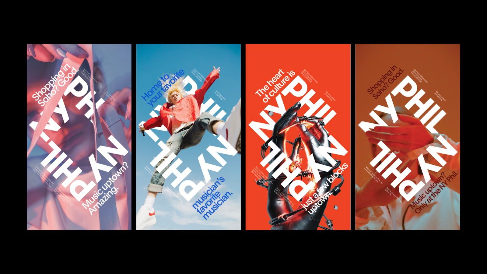
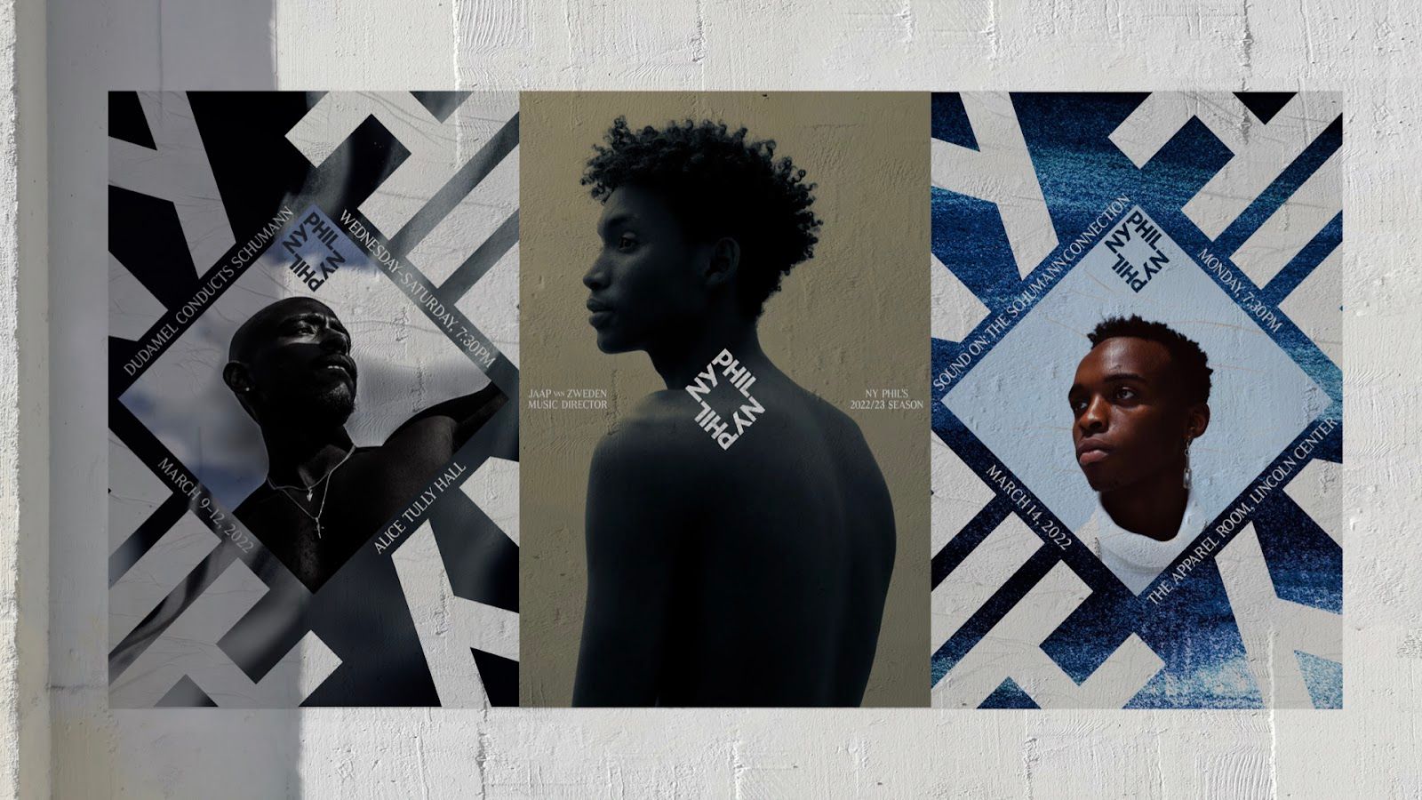
During her time at Ogilvy, Woojin was given the opportunity to contribute to a range of high-profile branding projects, but one stood out above the rest: the full rebranding of the New York Philharmonic. Working directly alongside the agency’s head of design, she helped craft a new identity for the institution—an effort that went on to receive recognition from D&AD and The One Club. For Woojin, the experience was both creatively formative and personally rewarding, offering a chance to shape the image of one of the world’s most iconic orchestras.
The design concept was rooted in the essence of New York itself. Just as the city’s grid surrounds the Philharmonic, audiences encircle the orchestra, making the institution the cultural heartbeat of the metropolis. This idea guided the creation of a logo that captured not only the Philharmonic’s role in the city but also the emotional resonance of live performance. The visual system extended beyond the logo to encompass concerts, musicians, and the entire audience experience, creating a unified identity that celebrated both heritage and accessibility.
The result was a brand that reaffirmed the Philharmonic’s place at the center of New York’s cultural life, presenting it as both timeless and alive with modern energy. By weaving together design, storytelling, and a deep respect for music’s communal power, the project demonstrated how visual identity can elevate an institution while keeping it rooted in the heart of its city.

Woojin later moved to Mother Design, a globally recognized agency celebrated for pushing the boundaries of branding. She worked on identity systems for Adobe and an upcoming project for Marathon. Here, she was encouraged to experiment with visual storytelling and translate strategic thinking into cohesive design systems.
“Mother offered a space to explore ambitious projects with forward-thinking clients,” she notes. “It showed me how bold design and cohesive storytelling can transform a brand’s perception.”
Today, Woojin works in-house at GlossGenius, a platform providing digital tools for independent beauty professionals. Shifting from agency life to a single-brand focus has offered a new perspective. Working closely with leadership, she now explores the deeper layers of brand identity, shaping visuals with an insider’s understanding of company vision.
“It’s very exciting to create something completely new for a brand,” she says. “Being inside the company allows me to see everything closely. I’ve learned things here that I couldn’t anywhere else. Now is the funnest time because we’re creating something completely new.”
Unlike many in today’s digital age, Woojin intentionally avoids constant screen use when outdoors, choosing to focus on textures, colors, and small details in her environment. She draws inspiration from documentaries, films, and real-world observation, believing that careful attention to detail directly informs creative thinking.
“Inspiration is everywhere, if you take the time to notice,” she notes.
Beyond her full-time role, Woojin continues to explore independent projects that reflect her curiosity about design’s emotional dimension. One standout is her branding work for Colored Scent, a Korean perfume brand that translates colors into fragrances. Each scent embodies the mood and emotion of a specific color. Woojin captured this concept through a logo featuring softly connected letters, evoking fragrance and color slowly diffusing into the senses. The minimal typography and refined execution reflect her ability to balance story, feeling, and design in harmony.

Woojin’s career demonstrates how curiosity, observation, and storytelling converge in modern design. From early exposure to diverse cultures to award-winning agency work and in-house innovation, she exemplifies how global perspective and personal experimentation enrich professional practice.
“The future is about continuing to watch, think, and create,” she reflects. “Design is not just about shaping brands, it’s about shaping the way we see the world.”
2016-03-21


